VapeXscape
Most clients need a logo. This one needed a whole brand system: a storefront badge for a vape lounge in West Corners, NY, a separate identity for Oakley Fog — the shop's own juice line — and label artwork across a full flavor lineup.

One badge that works everywhere
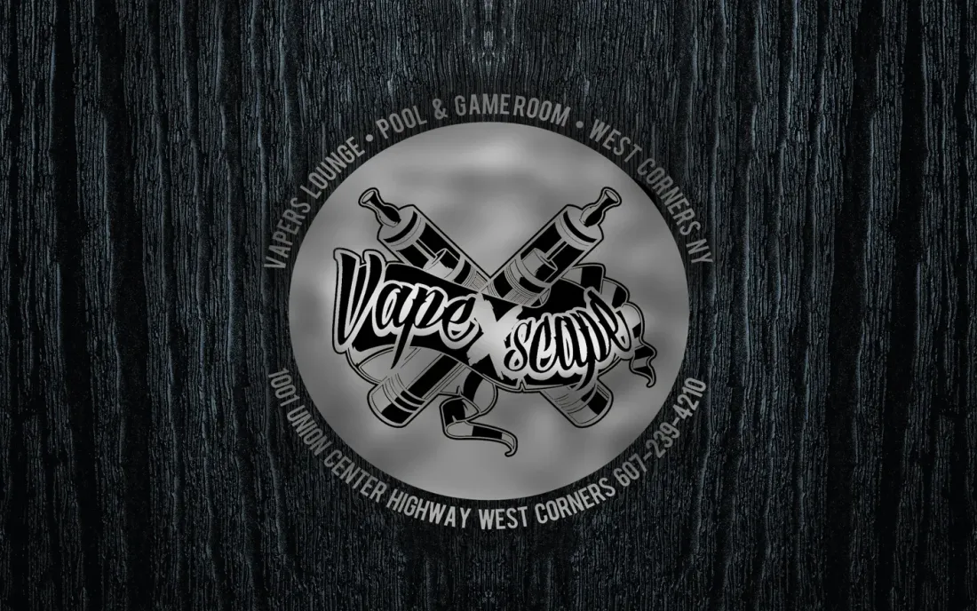
A tattoo-style badge — crossed devices behind a script wordmark, wrapped in a ring that carries what the place actually is: vapers lounge, pool and gameroom, plus the street address and phone number.
Building the venue details into the ring means a single asset covers a storefront sign, a sticker, and a shop stamp without a separate layout for each.
Oakley Fog, the in-house juice line
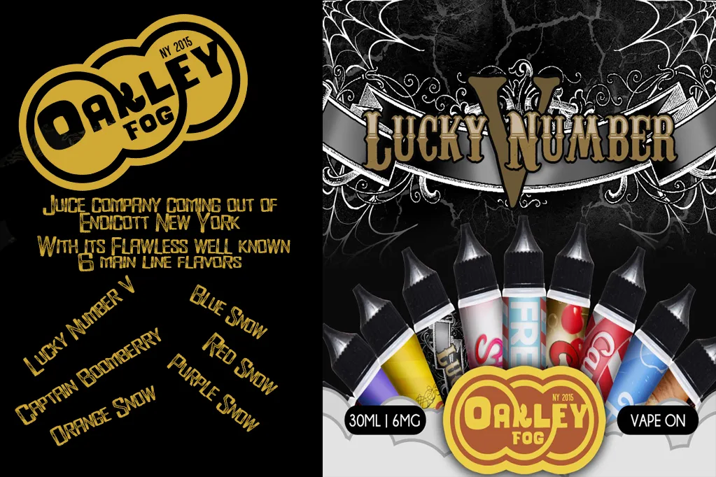
The shop bottled its own e-liquid out of Endicott, NY, and it needed to stand on its own shelf — not read as shop merch. So Oakley Fog got its own mark: three interlocking rings in thick bubble lettering, stamped "NY 2015", built in black and white versions so it could sit on a bottle, a banner, or a promo sheet.
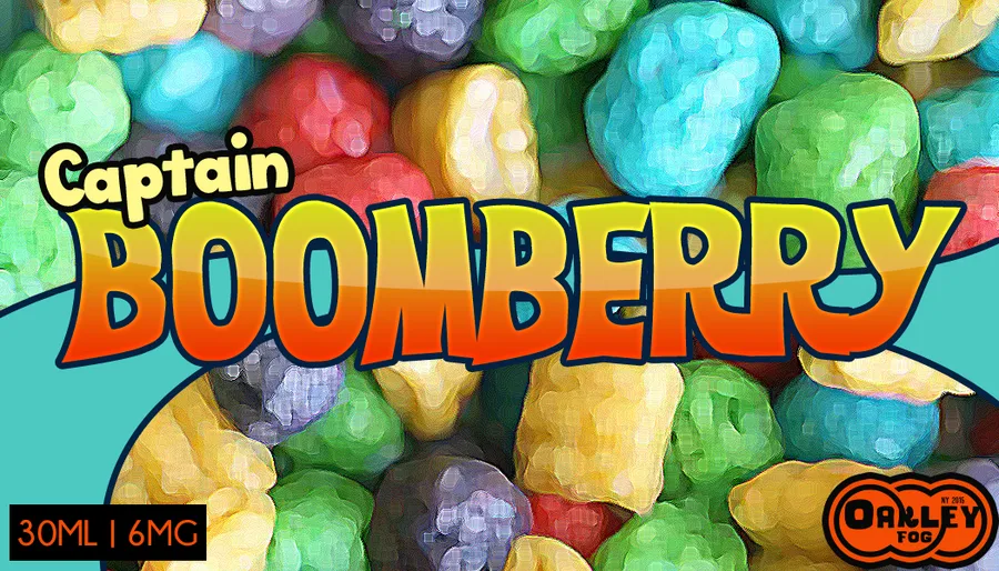
The promo piece introduced the line and its six main-line flavors — Lucky Number V, Captain Boomberry, and the Orange, Blue, Red and Purple Snow series.

One illustration, three flavors
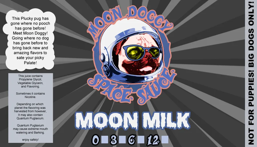
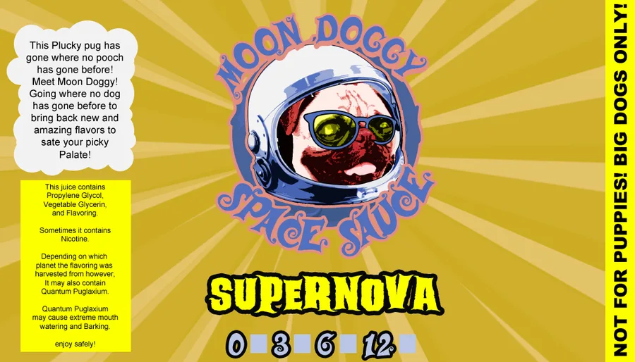
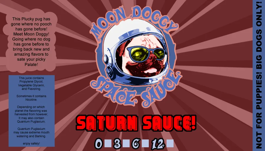
The Moon Doggy Space Sauce labels share a single illustration and change only the palette. The series stays recognizable from across a shop, each flavor still reads as its own thing, and adding the next one costs a recolor instead of a new drawing.


Designed for a curved label, not a flat rectangle
Artwork gets wrapped around a 30ml bottle, so the parts that matter have to survive the curve. Lucky Number V runs its ornate lettering down the length of the bottle; Blue Cake keeps a flat field and oversized type so it still reads at arm's length on a shelf.
Six more from the flavor library
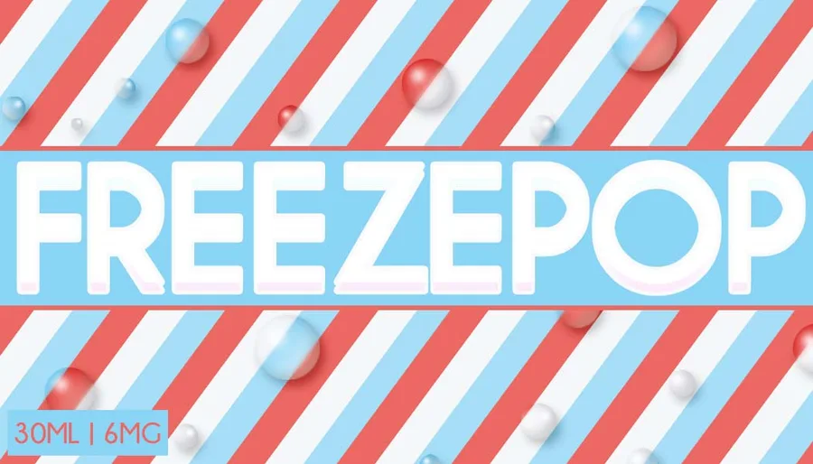
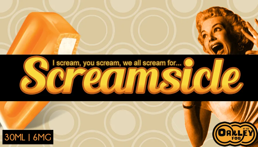
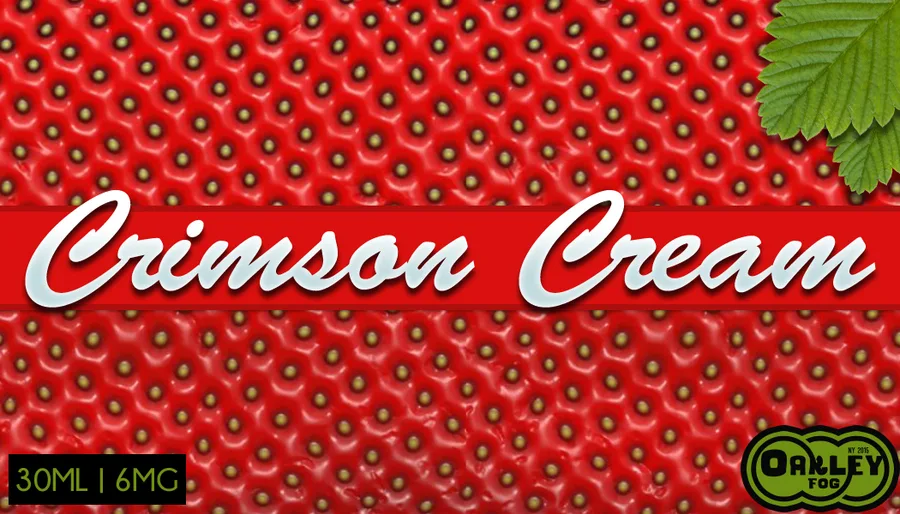
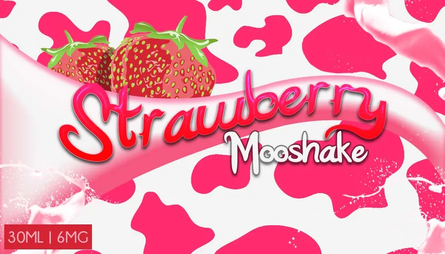
Away from the Moon Doggy series, each flavor got its own illustration style — candy stripes, cartoon lettering, painted fruit — while the bottle format and layout kept the whole shelf looking like one brand.

The age gate
Every vape brand's site opens with an age check, so it's the first thing anyone sees. This one was designed as a proper brand moment instead of a plain form — the badge in brushed silver on dark wood, carrying the same identity as the storefront.
Need more than a logo?
Sub-brands, packaging, print — the whole system, designed to hold together.